Algebra of the Visual: The London Underground Map and the Art It Has Inspired
by Alan Ashton-Smith
published January 2011
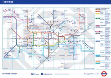
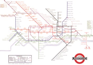
The London Underground symbolizes London, and the London Underground map, designed by Harry Beck in 1931, symbolizes the London Underground. Accordingly, Beck’s map has in itself come to be a recognizable signifier of London. Its impact resonates beyond this city though: it is also the prototype for metro maps worldwide, with its basic topological structure having been adopted for use on the subways of many other cities.
Indeed, a cursory glance at the map of almost any metro system in the world will reveal the impact that Beck’s map has had on their designs. Bold colors, diagonal lines, and the ticks or circles used to represent stations feature on maps from Boston to Berlin to Buenos Aires. And the maps for brand new underground rail systems continue to be designed in this way.
Its influence has gone beyond the cartographic however; Ken Garland points out that “the invention of the London Underground Diagram made an important contribution to the development of graphic design in the twentieth century” (Garland 62). Furthermore, the map has been appropriated in artwork; the best known example of this is Simon Patterson’s piece "The Great Bear," in which the map is reproduced with the names of the stations substituted for those of noted personalities, categorized by line.
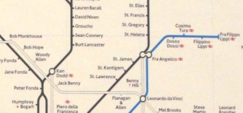
Those on Northern Line, for example, are given the names of film actors, while Jubilee Line stations are renamed after footballers. The navigational properties that seem to be innately part of Beck’s map are thus removed, and while "The Great Bear" does convey information presented in a logical fashion, the connections on the map become meaningless. As Patterson has said:
There is no code to be cracked in any of my work. Meanings may not be obvious, you may not get a joke, but nothing is really cryptic – I’m not interested in mystification. I like disrupting something people take as read. I am not simply pulling the rug out from people (Greenburg 47).
So Patterson’s piece can be read as an example of subverting an established system. However, Beck’s map lends itself to artistic reinterpretation not only on account of what it represents, but also due to the appearance of the map itself. The white background augmented with straight lines and solid colors recalls Mondrian
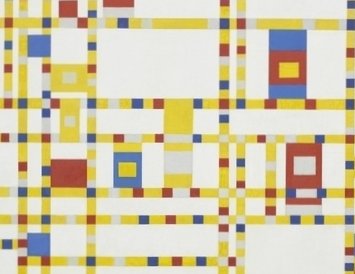
and De Stijl, but at the same time, the multi-limbed spider of the whole map could, at a distance, be a Jackson Pollock splatter. The fact that a copy of the map has been displayed at the MOMA is evidence that it is seen as an aesthetically noteworthy design. Indeed, the map’s aesthetics can also be found in contemporary art which does not directly draw on Beck’s design. Dutch artist Ronald de Bloeme’s work features blocks of color that are also reminiscent of De Stijl, and he has discussed the underground map with reference to how lines of color can be used to communicate:
Look at the London tube map for example. It’s a communication system everybody knows. It shows how we move. I find that fascinating. I mean designers think about how to get our attention and how to get a message across, how to communicate. It’s all information and often we don’t even realize it anymore. But, yes, it’s that fine line between recognizing something, or not, that makes it interesting for me (Poulain).
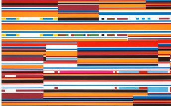
This is testament to the fact that Beck’s design is essentially a means of conveying a large quantity of information in the simplest way possible. Mark Ovenden has noted that, “the simplicity of graphic symbols now includes other pertinent information for travellers. Essentially the map has fully evolved into the diagram” (Ovenden 9). As a result, it is not surprising that artists who want to engage with communication have used it as a source. Designers have certainly been inspired by the Underground Map when conveying information. This can be seen in the numerous advertising campaigns – usually designed to be displayed on tube trains – that use the well-known style or typeface of Beck’s map. Often, the names of stations are supplanted into sentences in advertisements: for example, consumers have been told they would be ‘”Barking” mad not to take up certain offers. The familiarity of the map and its components is utilized here, suggesting that the map has become rather like a universally comprehended language. Communicating in this language allows designers to reach out to their audiences, and manipulating it allows artists to convey their messages in an accessible way.
On a more amateur level, the practise of “map-mashing” became a minor internet meme in 2006, until Transport for London objected that it infringed copyright. Map-mashing often works on the same basic principles as "The Great Bear" – the station names are altered so that the map links pieces of information together, but rescinds its usefulness as an aid for navigating a geographical space. Examples include a map in which the names of the stations are anagrammatized, and one in which they are replaced by the names of foodstuffs that assonate vaguely with the station names: Oxford Circus becomes Oxtail Soup, for instance. Music journalist Dorian Lynskey used the names of bands and musicians on his map, nominating a different genre for each line. This was exceptional not only because he sought permission from Transport for London to produce the map, but also in the sophistication with which he handled interchange stations.
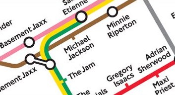
At points when the Rock (District) and Blues & Country (Piccadilly) lines intersect, crossover artists such as Neil Young and Wilco are used. Kings Cross St Pancras, which has the most interchanges, is therefore represented by the most eclectic musician on the map: Beck. Of course, this could also be read as an homage to the original map’s creator.
These interchanges are significant in that they make the map more functional than similar examples of map-mashing, including The Great Bear. It is not just wordplay or frippery, but actually operates as an aid to navigating genres of music and locating the moments where they connect. Lynskey is constrained by the limitations of the original map, but still succeeds in his aims of producing a logical diagram. The musical map does not stop at being art; in fact, that is perhaps the least important of its functions. It is also an example of cartography and, moreover, of classification. Lynskey describes how “I also followed chronology wherever the path of the line allowed it. Each branch line represents a sub-genre: rock sprouts off into grunge and psychedelia when it reaches South-West London; hip-hop diverges, north of Camden, into old school and New York rap” (Lynskey). This is a form of organization that is made to fit within an existing formula, an algebra of the visual. As Lynskey puts it:
It's an experiment to see if one intricate network can be overlaid on a completely different one. The elegance and logic of Harry Beck's design—its combination of bustling intersections, sprawling tributaries, long, slanting tangents and abrupt dead ends, all sucked into the overturned wine bottle of the Circle Line—seems to spark other connections and appeal to the brain's innate desire for patterning and structure.
So Beck’s map is used as a taxonomic template. It is a means of visualizing a complex transport network, but it also provides a starting point for the visualization of other networks. Simon Patterson was evidently aware of this when he said, discussing The Great Bear, that “[W]hat interests me is juxtaposing different paths of knowledge to form more than the sum of their parts” (47). Patterson’s categorized personalities intersect at interchanges stations in a more arbitrary way than Lynksey’s musicians; however, the clashes that ensue may be seen as new forms of organization. Connections that might otherwise not be conceived are brought about through the previously delineated structure of the diagram. It is also noteworthy that the name Patterson has chosen for his piece evokes organization, recalling the practise of using the stars to navigate.
Lyndsay Martin is another artist who has played with the London Underground map in her work. Her Beck-inspired piece is closer to Lynskey’s than Patterson’s in that the map retains its navigable function. However, this is limited since her delete tube map entails the removal of most of the station names. She says that “[I]t’s all about deleting the unimportant information and discarding the leftovers. I left only the tube stations which I needed, however the stations on their own wouldn’t be functional we need the in between stops in order to confirm we are going in the right directions [sic]” (Martin). This is an interesting point, drawing attention to that fact that navigating with the Underground Map is not simply a process of going directly from A to B; there are many points in between, all of which act as marking posts along the route. It recalls Foucault, who wrote in The Order of Things:
I can recognize, in effect, what the order is that exists between A and B without considering anything apart from those two outer terms; one cannot know the order of things “in their isolated nature,” but by discovering that which is the simplest, then that which is the next simplest, one can progress inevitably to the most complex things of all (59).
This is a process familiar to anyone who has used Beck’s Underground Map, or indeed one of any number of similar maps, to plan a route. The simple connections between stations are compounded until they become connections between lines, and these are then connected together until they become, ultimately, a whole journey. Foucault also states that “[a]ll representations are connected as signs; all together, they form, as it were, an immense network; each one posits itself in its transparency as the sign of what it represents; and yet—or rather, by this very fact—no specific activity of consciousness can ever constitute a signification” (Foucault 72). Each individual station on the Underground Map is a point of signification, and the map is essentially a network of signs. This results from the topological form of the map; it excludes everything outside of the underground network and refines the vast terrain of the city into a more easily navigable space. Janin Hadlaw has said that of the map that “[b]y ‘ignoring geography’ in representation, Beck’s ‘common sense’ perception resonated with the emergent concepts of distance and duration [...] Now, proximity of place was determined by typographic (as opposed to geographic) concerns” (Hadlaw 33).
So Beck’s map is truly revolutionary, changing the way in which we plan routes from A to B. Moreover, it shows that navigation can be thought of as a form of organization, a means of reducing complicated vectors of movement to more comfortably digestible trajectories. As for the artists who have manipulated the Underground Map, they have engaged with this discourse of navigation in their work. Creating an artwork that has the predefined boundaries of the London Underground Map poses a specific challenge for the artist in that it requires one to organize. The spectators of these modified maps are also invited to organize the data that is presented in them. Both artist and spectator are thus working with a set of rules that have been set out in the Underground Map, and expanding its possibilities as a system of organization.
Works Cited
Foucault, Michel. The Order of Things. Abingdon: Routledge, 2002. Print.
Garland, Ken. Mr. Beck’s Underground Map: A History. Harrow Weald: Capital Transport, 1994. Print.
Greenburg, Sarah. “The Word According to Simon Patterson.” Tate: The Art Magazine 4 (Winter 1994): 44-47. Print.
Hadlaw, Janin. “The London Underground Map: Imagining Modern Time and Space.” Design Issues 19.1 (Winter 2003): 25-35. Print.
Lynskey, Dorian. “Going Underground.” The Guardian Culture Vulture Blog, 3 Feb. 2006. Web. 12 Nov. 2009.
Martin, Lyndsay. “The Great Bear.” Lyndsay2905’s Weblog, 14 Apr. 2008. Web. 12 Nov. 2009.
Ovenden, Mark. Metro Maps of the World. Harrow Weald: Capital Transport, 2003. Print.
Poulain, Nadine. “Interview with Ronald de Bloeme.” Whitehot Magazine, Sept. 2009. Web. 12 Nov. 2009.
Figures:
1. Transport for London. “Standard Tube Map.” Transport for London. London, England. Map. Scale not given. 2010. Web. 24 Jan. 2011.
2. Beck, Harry C. “The London Underground.” The London Tube Map Archive. Eds. Rogier Creemers et al. Map. Scale not given. 1933. Web. 26 Jan. 2011.
3. Patterson, Simon. “The Great Bear” (detail). 1992. Lithograph. Photograph by Sean Scanlan. London Transport Posters 1920s–1940s. Museum of Modern Art, New York. 5 Nov. 2010. jpeg.
4. Mondrian, Piet. “Broadway Boogie Woogie.” 1942-3. Oil on canvas. Museum of Modern Art, New York. MoMA, The Collection. Web. 26 Jan. 2011.
5. de Bloeme, Ronald. “Ironie.” 2009. Enamel on canvas. Hamish Morrison Galerie, Berlin. Artfacts.net. Web. 27 Jan. 2011.
6. Lynskey, Dorian. “Music on the Tube Map.” 2006. “Going Underground.” The Guardian Culture Vulture Blog. Web. 27 Jan. 2011.
