![]()
Robert Peeters lives in the Netherlands. He is developing a theoretical perspective on The Return from his academic background in philosophy, a non-clinical reading of Lacan, and a personal love for the art of the 20th century.

Contact: [email protected]
Someone Is in My House: The Art of David Lynch at the Bonnefanten Museum
by Robert Peeters
Published February 2020
Abstract:
The works exhibited at the Bonnefanten Museum in Maastricht, The Netherlands, represent an extensive overview of David Lynch’s non-cinematic output over an artistic career that’s well into its sixth decade. It presents a welcome background to the films that made him famous. It also stresses his stature as an artist, independent of cinematic renown. What I intend to show here is that both are in fact part of the same expressive gesture—a gesture to which the third season of Twin Peaks marks a crowning achievement and a return to his earliest thematics. What’s more, the use of legible text in the artworks provides a glimpse into the method of the creator of Twin Peaks. Understood as such, we can view them as more than just a background to the films; analyzing this method provides a key approach to the more enigmatic moments of Lynch’s cinematic works.
“The canvas is an empty space; it’s a visual world. You want to turn things into an intellectual game. It’s not.”
(“Leonora Carrington: TateShots.” 00:05:55-00:08:09)
1.0 The Exhibition
Someone Is in My House (Nov. 30 2018–Apr. 28 2019), held at the Bonnefanten Museum in the Dutch city of Maastricht, was the largest overview to date of artworks by David Lynch. It came in the wake of a renewed public interest in Lynch’s work overall, following the recent third season of Twin Peaks. This suggests a question: would Lynch’s artworks merit a large-scale exhibition if not for the interest generated by the television series? Curator Stijn Huijts’s introduction to the exhibition catalogue immediately confronts this problem head-on: in spite of his questionable status as celebrity painter, Huijts attests that Lynch’s work as a director has always been rooted in his work as a visual artist. In her contribution to the same publication, Lynch biographer Kristine McKenna attests this is at least biographically true: Lynch’s career as a filmmaker evolved from his background as a visual artist. The question could then perhaps be more interestingly put: how do the artworks at this exhibition, which span his career from the late 1960s up to the current day, relate to Lynch’s vastly more well-known cinematic endeavors?
1.1 Presentation
The museum certainly played to the recent Twin Peaks upsurge when installing this show: red velvet drapes and chevron flooring were a theme throughout the building. A simulated Red Room was set up in the entrance hall, and one passageway between exhibition rooms had been similarly upholstered. As if that wouldn’t have been enough, even the elevator interior was covered in a red velvet and chevron pattern, and the opening chords of Laura’s Theme ran on repeat along the main hallway leading up to the exhibition space.
Apart from such thematic genuflexion to the popular imagination, the exhibit itself was also notably dramatic in its staging: Dimly lit, sporting dark grey walls to the point of bordering on the cavernous. Even the museum’s ceiling skylights appeared to have been filtered for effect. The overall impression was one of a cloistered space: visitors entered from the exhibition’s sunlit atrium room into the exhibition proper by way of a pair of automatic double doors. Upon approach, these opened onto a smaller dimly lit room. One was immediately confronted with a large-scale blowup photograph of the artist at work in his studio, accompanied by the siren sound coming from the video installation piece, Six Men Getting Sick (Six Times), just out of view. Once inside, the visitor was introduced to Lynch’s earliest drawings. Of the ensuing fifteen rooms, the majority were also low-lit, painted grey, and largely devoid of outside reference points. The light in these came mainly from dimmed spotlights and a darkened skylight.
The first thing that came to mind walking through the rooms was the sheer overwhelming amount of material. Lynch must have been obsessively drawing on anything at hand for decades. He appears to be a naturally talented draftsman, as attested by some very early drawings. Collected over a career that has spanned five decades, restaurant napkins, typed scripts, general notes, and seemingly any paper that passed through his hands bore anything from curious doodles to entire vistas. There was even a wall segment filled with framed, pen-drawn miniatures, meticulously executed on empty matchbooks.
1.2 The Works
A first impression of Lynch’s canvases, for those not familiar with them, is that they are generally large-scale, and often comprise several contiguous panels. They mostly involve sculpted elements and are highly textured, sometimes to the point of becoming intentionally repulsive, as for instance in Rock with Seven Eyes (1996). In one extreme case, this even goes as far as incorporating an actual rat carcass preserved under the varnish. Lynch’s habit of mixing black into his paints is so much a given that an explanatory quotation was taken from Lynch on Lynch, Chris Rodley’s book of collected interviews with the artist, and featured on the wall of one of the first rooms, almost as an apologetic acknowledgement, preparing the visitor for what’s to come (Rodley 20).
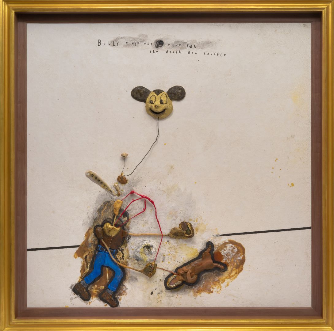
When there are recognizable, figurative scenes, these often appear deceptively simple or even humorous. In looking at Lynch’s works, first impressions are almost always misleading and give way to the uncanny. The first thing one notices in Billy Sings the Tune for the Death Row Shuffle (2018), for instance, is something which looks like a Mickey Mouse balloon. The way the work was shown in Maastricht, one was made to walk toward it from the side, only gaining a full view in the last couple of paces. This made for a curious progression of impressions: At first, the Mickey Mouse shape takes the place of the body’s actual (but either missing or detached and shrunken) head in the figure’s body scheme. From then on, one slowly becomes aware that the body proper ends in a stick neck with a shapeless protrusion instead of a head with another, wiry red shape latched on to it. Two more vaguely organic-looking shapes float above the body. The first is attached to a very diminutive head with the appearance of bone, the second to the comical and unnerving Mickey Mouse balloon-head. It is only when fully taking in the work from nearby that the wiry shapes appear to be a nightmarish red mosquito-like creature, recurrent in this series of works, which has attached itself to that body.
A significant portion of the works on display were made in the late 90s and 2000s. Many of these present the onlooker with tableaus wherein a small number of recurrent primitive figures are accompanied by integrated, textual comments. At a cursory glance, one could take this to be cut-and-dry figurative representation. However, the works’ major expressive power seems to lie elsewhere, and in Maastricht, one got the impression that this exhibition’s mode of presentation was designed specifically to bring this latter aspect to the fore as much as possible. For this reviewer, the difference was most salient in two oil-on-canvas works previously seen in Ljubljana, in a sunlit Tivoli Castle. Whereas those viewing conditions afforded a much clearer impression of Lynch’s painting style, the Bonnefanten’s mode of presentation made for a much more immersive viewing experience; leaving a more impartial, detached viewpoint for this immersive one successfully emphasized the specific expressive power of these works. This intention is reflected in museum curator Stijn Huijts’s idiosyncratic interpretation of the Lynchian, as opposed to what a general public might understand as such.
“Lynchian” has been defined by the Oxford English Dictionary as “[the use of] compelling visual images to emphasize a dreamlike quality of mystery or menace.” From what we’ve seen of the presentation in Maastricht, the Bonnefanten Museum has taken this definition to heart, albeit in an inverted form: it uses its thematic decoration and dramatic presentation to generate a “dreamlike quality of mystery,” which then serves to emphasize the compelling traits of Lynch’s images. Huijts himself defines the Lynchian as “a fascination with things that are under the surface, the fourth dimension, things we don’t know, the subconscious” (Siegal 2019). The exhibition he curated appears to regard the two definitions not just as concurrent, but indeed as connected: for Huijts, the most compelling aspects of the works are the ones that operate “under the surface,” and may not be immediately apparent. Judging from one of the interviews in Lynch on Lynch, the artist agrees: “There are things that can’t be said with words. And that’s sort of what painting is all about” (Rodley 26).
The overall effect of Huijts’s presentation of these works could indeed be described as “a dreamlike quality of mystery,” and this did manage to stress the compelling visual aspects of the images. One could not help but be drawn in. But if painting is all about things that cannot be said with words, as Lynch notes, then why do so many of his paintings incorporate written phrases, names, and sentences?
2.0 Text vs. Texture
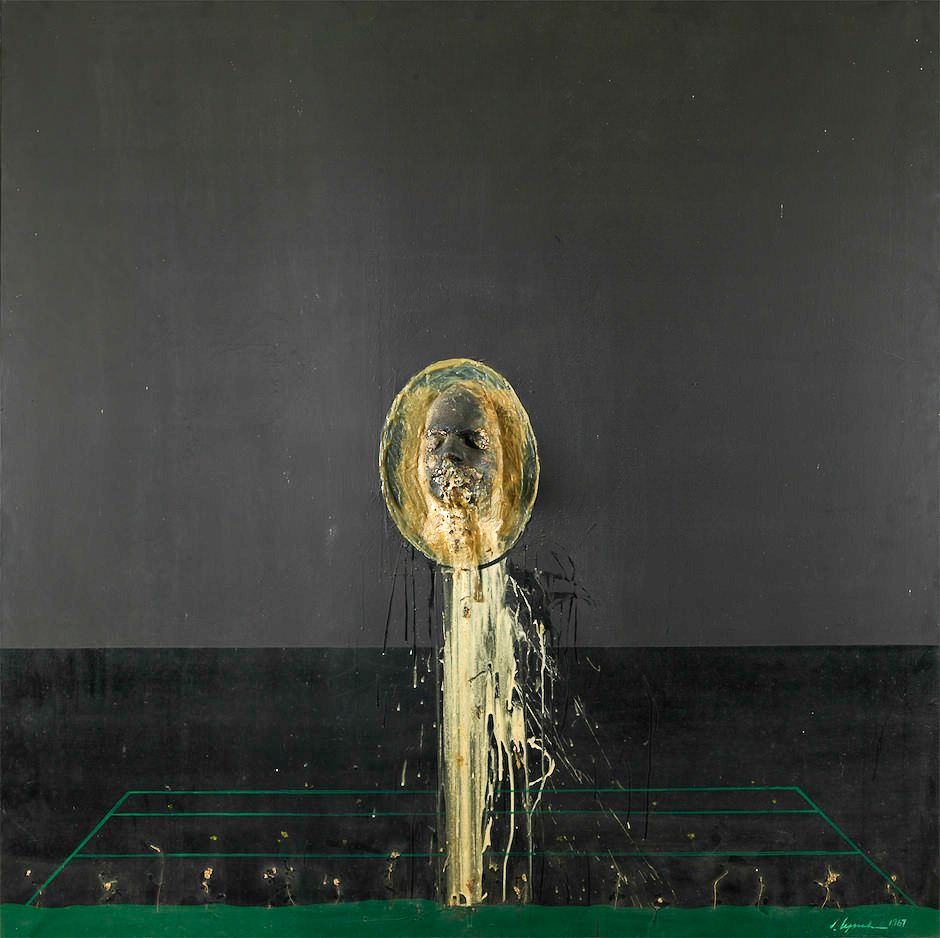
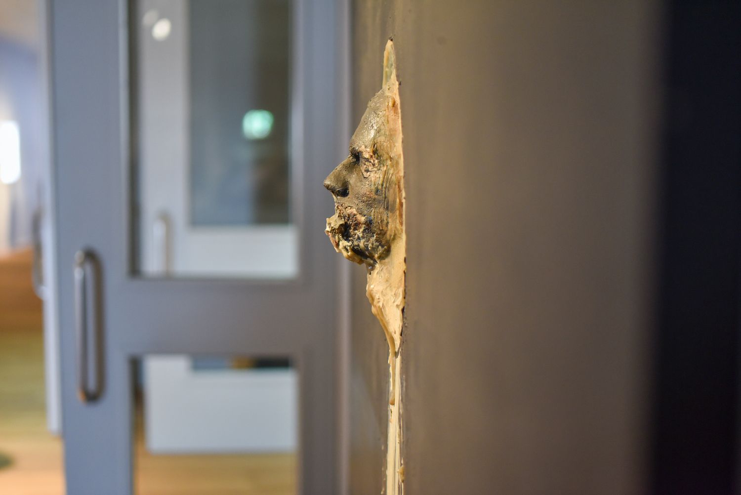
A definitive answer to the question of why Lynch uses painted fragments of text in his artworks perhaps can’t be given. What they do pose is a mode of expression that can be opposed to and distinguished from other aspects of these canvases. In his review of the earlier David Lynch: The Unified Field exhibition at Pennsylvania Academy of Fine Arts, James Hoberman identified a particular development in Lynch’s artistic style. What Hoberman noticed is that the works from Lynch’s Philadelphia period, that is, up to 1971, were “brutally textural.” Indeed, works from the earlier period seem much sparser than Lynch’s later canvases, using a style that is heavily influenced by Francis Bacon. If these can be said to incorporate text at all, it is by way of suggestive titles alone. Any figures that appear in works from this period aren’t as clearly involved in scenic interactions, such as for instance in Man Throwing Up (1968). As Hoberman notes, large areas of contrasting textures dominate the work. The major contrasts are between the matte black background, a sculpted, protruding face at the center of the work, and a line-drawn geometric shape that implies perspective.
Hoberman describes Lynch’s more recent works as “large-scale dramatic canvases,” as they involve interactions between dramatic characters. These works “could be more accurately described as assemblages,” in reference to the integration of divergent elements. The example he calls to mind is Mister Redman (2000), which “employs dice, matchsticks, band-aids, epoxy, distressed fabrics, chicken feet and lumps of oil paint.” Indeed, the canvases from this period show us what appear to be dramatic scenes involving one or more characters. We can add to this that Mister Redman also uses large painted phrases that offer some context to the depiction.
2.1 Modes of Expression
What I’d like to offer in addition to Hoberman’s insight, perhaps superfluously, is that Lynch never left the “textural” aspect. It gradually developed into a use of constructed mixed media as part of what Hoberman calls dramatic, i.e. a scenic, depiction. The scene is built up from elements which in themselves retain a visceral, expressive aspect. As such, the textural forms a distinct “layer,” or mode of expression in Lynch’s later works, an undercurrent to what look like more or less straightforward figurative depictions. This aspect marks what curator Huijts sought to bring out in each of the works with this exhibition’s particular mode of presentation.
This division into two separate modes of expression in Lynch’s works is further complicated by his use of text added into the painting. These most often take the shape of crudely painted letters, reminiscent of the work of Tracy Emin. The painted phrases often suggest an account of the painted figures and their supposed actions or relations. It is my contention that these phrases actually nudge the onlooker away from any visceral undertones identified from Hoberman and Huijts as a distinct mode of expression.
2.2 Two Examples
In the case of Mister Redman, for instance, the added text “Because of wayward activity based upon unproductive thinking BOB meets mister REDMAN,” offers a childishly simple storyline from which to regard the painting’s signification as closed. The figure’s reaction, “oh no,” further consolidates this closure, and onlookers may feel they have adequately considered this canvas and move on. To become aware of any impressions that could be said to belong to the “brutally textural,” one has to ignore these written phrases and, say, consider the monstrous shape of the red figure, or its repulsively resin-like belly that holds a set of dice. The painted text forms an added mode of expression that does not necessarily coincide with the scenic or the textural modes, and the onlooker has to actively suspend the tendency to reach a point of closure in considering the work.
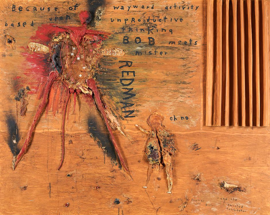
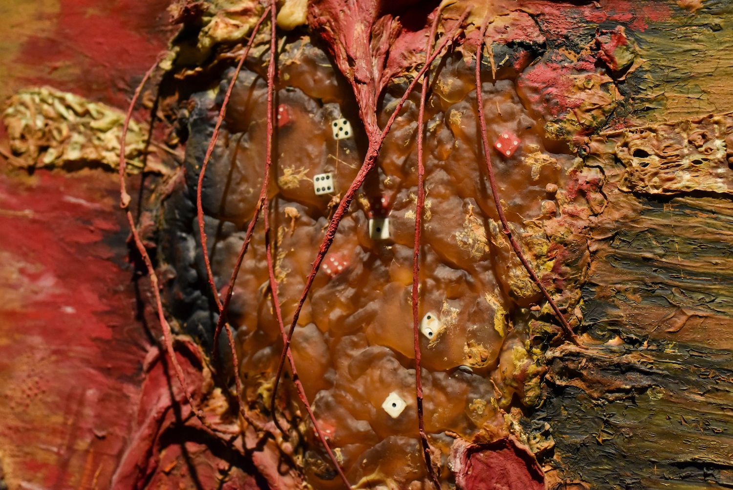
In addition to these literal significations, Mister Redman also provides us with recognizable objects and their concomitant associations that have been integrated into the work. Most markedly, as Hoberman already observed, a set of dice can be seen inside the Redman figure, and what appear to be overstretched, distressed, and thickly overpainted band-aids at its sides. To someone considering this work, these may bring along associated notions of chance and wounding, respectively. I’d like to suggest that such associations occur fundamentally on the same level as the painted phrases: they also draw the onlooker into a one-sidedly concept-driven, linguistic signification. Such associative significations may be radically open-ended, as opposed to those from the painted phrases which provide closure. The net effect in both cases however is that any appreciation of the work from such aspects remains on a sanitized, purely cognitive level, negating what we’ve identified as the “brutally textural” (Jones and Woodward 170).
In the example of Man Throwing Up something similar, if perhaps less refined, occurs. We are confronted with a plaster cast of a man’s face from whose mouth a bilious yellow substance appears to ooze. Below, a line-drawn trapezoid that looks like one of Francis Bacon’s box shapes provides the illusion of perspective. Given the title, one may legitimately draw the conclusion that this is simply a depiction of a man throwing up. One might even conclude that Lynch is confronting a fascination with visceral reactions head-on. Looking back on this early work from the hindsight of his later oeuvre, however, we may also conclude that such abstract, rectangular shapes have arguably become his most recurrent concept: from house exteriors to room interiors, including even the recent Twin Peaks: The Return’s ‘black box’ and metal box floating in space, the cube shape has been a central motif.
Looking back at this box-like shape, it can be understood as a highly abstract rendition of the motif of the house. Man Throwing Up can then be seen as a figure throwing itself up, out from being boxed in. In fact, the theme of egress from such a shape is exactly what happens in The Return: violently in the case of the monster bursting from the glass box, nonviolently when Cooper emerges from the metal box with Naido. Whereas Bacon used these structures to isolate his figures from their worlds (Deleuze 5-9), Lynch’s figures of this early period are never simply boxed in. Lynch’s figures are invariably pictured in some other relation to the structure; time and time again they’re shown to escape or elude being boxed in (McKenna 15-16).
2.3 Misdirection
With the benefit of hindsight, we may identify a misdirection suggested by the title, Man Throwing Up. It directs our focus onto the figure of the face and suggests an overly facile conceptual interpretation. Conversely, shifting focus to the shape in the background one may the conceive of a theme like we’ve just explored. The other work, Mister Redman, showed similar properties: integrated lines of text nudge the onlooker toward an interpretation Hoberman calls “dramatic,” i.e., as the depiction of a relation between dramatis personae. Additionally, he characterized Mister Redman as an “assemblage,” incorporating real-world objects and their associated meanings: a number of dice and band-aids may lead onlookers to consider the work from their own associations with chance and wounding.
Both uses of text such as the suggestive title and the integrated words direct the onlooker’s attention away from the ineffable effect that Stijn Huijts tried to stress at this exhibition. The two modes of expression take on the shape of manifest and latent content, respectively. The latter effect lies with the “textural,” which Hoberman identified as predominant in the earlier output, but which is still undeniably present in later work. What we have, then, is a pattern of using what is self-evident from a linguistic, signification-oriented viewpoint to obscure from conscious attention the work’s more visceral, latent expressiveness. Literal and associative aspects of the works, i.e., painted phrases and assembled everyday objects, suggest to the viewer a conceptual, cerebral interpretation that shifts attention away from the visceral.
3.0 Conclusion
Where does this pattern of misdirection leave us with regard to our original question? How do these works relate to Lynch’s work as a director? To answer this, we can return to our earlier quote and this time cite it more extensively. Interviewer Dennis Rodley suggests that painting is still Lynch’s primary activity from which everything else emerges. Lynch answers:
It is. […] There are things that can’t be said in words. And that’s what painting is all about. And that’s what film-making, to me, is mostly about. There are words and there are stories, but there are things that can be said with film that you can’t say with words. It’s just the beautiful language of cinema. And it has to do with time and juxtapositions and all the rules in painting. Painting is one thing that carries through everything else. (Rodley 26-27)
The answer to our question of how the artworks relate to the films, then, is attested here by interviewer Rodley, and by biographer Kristine McKenna, as well as exhibition curator Stijn Huijts, in their essays for this exhibition’s catalogue: Lynch’s filmmaking continually originates from his work as a visual artist—and not the other way around. In his reply to Rodley, we have an uncharacteristically detailed exposition of the way David Lynch himself sees this. Lynch emphatically equates the ability of both painting and movie-making to express what can’t be said in words. Equally notable is the association Lynch makes from words to stories. The implication seems to be that a film’s narrative operates only at the manifest level, but that the “language of cinema” comprises those very wordless things that “painting is all about.” This clearly parallels the traits we’ve distinguished in the artworks. In section 2.2, we asserted that Lynch’s use of literal and associative content in his artworks leads the onlooker down a path of interpretation that is potentially unending. Jones and Woodward explore this very same effect in relation to Lynch’s films: The tendency, among the general public as well as in academic reception, is to provide meaning where this is perceived lacking (165). They go on to suggest an alternative approach to Lynch’s films that is respective of this distinction between uses of manifest and latent content as we’ve described.
Yet if painting really is the one thing that carries through everything else, as Lynch notes, then this will not be enough. Any future interpretation of the films should be enriched by taking account of Lynch’s artistic themes and influences as they can be gleamed from his interviews, his biography, or from the works themselves. The obvious example in our text has been Francis Bacon, as this is one of the very few artists whose influence Lynch has readily admitted (Rodley 16-17, Barney 128). Beyond the visual arts, Kafka is the one other definite example. Yet undeniable parallels with other artists have already been identified. For examples from Twin Peaks: The Return, see the YouTube video “The Art of David Lynch,” posted while the series was still airing. A structural pursuit of the way in which Lynch’s cinema is in dialogue with the history of painting, using the interpretative framework we’ve explored here, may finally yield a perspective on Lynch’s work as a filmmaker that moves beyond an explanation of “what it all means” to an exploration of the visual worlds he has created.
Works Cited
Barney, Richard A., editor. David Lynch: Interviews, UP of Mississippi, 2009.
Deleuze, Gilles. Francis Bacon: The Logic of Sensation. Translated by Daniel W. Smith. U of Minnesota P, 2002.
Hoberman, James Lewis. “David Lynch’s Bad Thoughts.” The New York Review of Books, 9 Dec. 2014.
Huijts, Stijn. “Preface.” Someone Is in My House, edited by Stijn Huijts, Prestel Publishing, 2019, pp. 4-5.
---. “Dark Matters.” Someone Is in My House, edited by Stijn Huijts, Prestel Publishing, 2019, pp. 31-36.
Jones, Graham & Woodward, Ashley. “How Desire Works: A Lyotardian Lynch.” Acinemas: Lyotard’s Philosophy of Film, edited by Graham Jones and Ashley Woodward, Edinburgh UP, 2017.
“Leonora Carrington—Britain’s Lost Surrealist: TateShots.” YouTube, 26 Mar. 2015, https://www.youtube.com/watch?v=lqXePrSE1R0&feature=youtu.be&t=294.
Lynch, David. Billy Sings the Tune for the Death Row Shuffle. Mixed media painting, 2018.
---. Man Throwing Up. Acrylic and resin on canvas, 1968. Rodger LaPelle and Christine McGinnis, https://www.nybooks.com/wp-content/uploads/2014/12/Man-Throwing-Up-Lynch.jpg.
---. Mister Redman. Oil and mixed media on canvas, 2000.
---. Rock with Seven Eyes. Oil and mixed media on canvas, 1996, https://www.nybooks.com/wp-content/uploads/2014/12/Rock-With-Seven-Eyes-Lynch.jpg.
---. Six Men Getting Sick (Six Times). Film and sculpted screen, 1967.
Lynch, David & Kristine McKenna. Room to Dream. Canongate Books, 2018. “Lynchian, adj.” OED Online, Oxford UP, March 2019, https://www.oed.com/view/Entry/69513711.
McKenna, Kristine. “Painting Is a Place.” Someone Is in My House, edited by Stijn Huijts, Prestel Publishing, 2019, pp. 11-19.
Rodley, Chris, editor. Lynch on Lynch. Farrar, Straus and Giroux, 2005.
Siegal, Nina. “David Lynch’s Art Peers Behind the Facade.” New York Times, 14 Mar. 2019. https://www.nytimes.com/2019/03/14/arts/david-lynch-art-drawings-retrospective-netherlands-.html.
“The Art of David Lynch.” YouTube, uploaded by VoorDeFilm, 28 Jun. 2017, https://www.youtube.com/watch?v=I-YD-ITSs6s.